Get the weekly SPARTANAT newsletter.
Your bonus: the free E-Book from SPARTANAT.

INTERVIEW: Smart patches by WNDSN
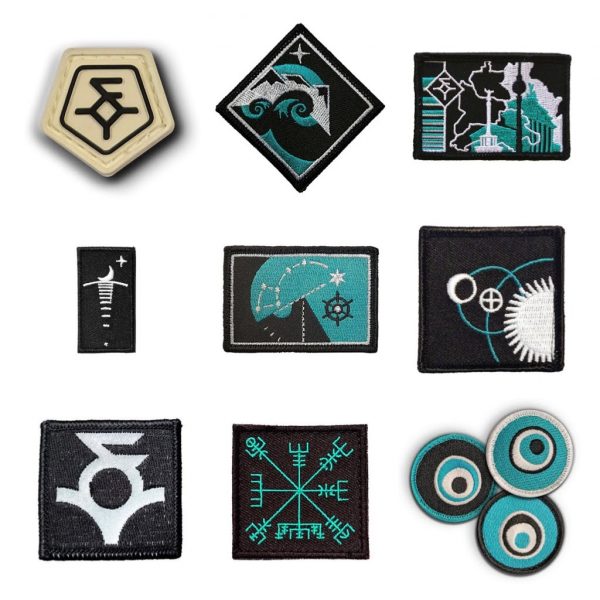
WNDSN's Patch Vault showcases their creative patches inspired by nature, stars, EMP, Vikings, and Berlin. With a focus on heraldic design and limited color palette, each patch tells a story and holds depth of meaning.

WNDSN is known for its top-notch calculation and measuring tools, the Telemeters. However, WNDSN is also very creative and active in the field of patches. This summer, WNDSN opened the Patch Vault and re-released some fan favorites. The inventory led to a conversation about how WNDSN even got into the topic of patches, which in turn led back into the past.
SPARTANAT: What was your first patch?
WNDSN: The first patch I designed was the retroreflective WNDSN patch.
What inspired you?
It was the year 2015. I was actually working on what later became the Telemeter. I wanted to create a memento to mark the beginning of what was to come with the Telemeter. I wanted something tangible in addition to the emerging Telemeter. It was a 2×2 patch, which was very special for that time. It was embroidered with a retroreflective material in the background and the inverted logo in black on top.
A play with the white space?
Exactly.
You have limited your patches to three colors, black, turquoise, and white. Why? And will you change this in the future?
In many of these designs, I intentionally refer to the art of heraldry, where rank and ancestry were first shown on armor on the battlefield and later as visual reminders of the achievements of one's tribe or family. I often directly reference heraldic traditions and use the color white as a symbol for silver.
Within heraldry, the concept of the coat of arms is the formal description of a coat of arms or flag following heraldic traditions. The blazoning has its own grammar, almost a subspace, which becomes the key to understanding the heraldic image one is looking at. The blazoning must be specific, concise, and completely clear.
In heraldry, there is the (coat of arms) shield, the divisions of the field, and the charges on the shield. The blazoning of the shield is of great importance, it is canonical, while there are several ways to visually represent what is found in the description.
Those who look closely will find many of my design descriptions inspired by heraldic blazoning.
How do you use colors?
In my double life as an artist, I've had several (color) phases, and you could say I'm currently in the turquoise phase. Black and white provide contrast, and turquoise has several reasons. Technically, it is possible to use turquoise on both black and white, providing the same contrast on both.
Your patches historically have three different themes: nature and stars, engagement with the logo, EMP, Vikings, and finally an urban series. Can you tell us about your inspiration for each series? How do they relate to the overall WNDSN story?
The Viking theme goes back to the name Wndsn (Norseman; Son of the strong winds and sea). The use of Nordic symbols dates back to this idea and is explained (with footnote) in the Blazoning of the Logo.
The stars, waves, and mountains are an extension of the Viking theme. The Vegvisir is about journeys and adventures on the way.
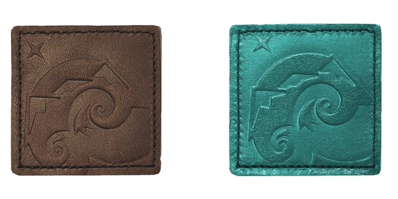
The Maker's Mark comes from the need for branding and celebrates the brand itself, after it has become somewhat known. The EMP arose from considerations that ultimately led to the instruments we develop today, namely that our high-tech society is quite fragile in critical parts and high-tech systems like GPS, but also low-tech devices like magnetic compasses, are susceptible to both natural and man-made disruptions. The EMP, electromagnetic pulse, is a spectacular example of a disturbance caused by humans that can be circumvented with devices and instruments that are immune to electromagnetic pulses. Both the undisturbed and the pulse-disturbed wave are shown on this patch.
The Berlin series is a homage to growing up in Berlin during the Cold War, a unique place at the time. It was called the "City of Spies," and the tension built into the environment in which I grew up significantly influences the work of Wndsn.
What was your best-selling patch?
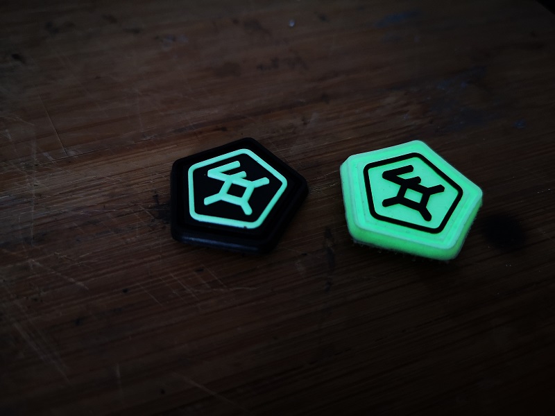
The Vegvisir, followed by the glow-in-the-dark Polaris and the Perpetual Explorer in leather. The Lunar Eclipse was also very popular.
Will you make the Lunar Eclipse patch again?
Maybe, if we sell out of our current stock.
What is your favorite patch?
My favorite patch is either the Polaris in turquoise leather or the three-colored Berlin Outpost of Freedom.
Which patch was a surprise hit?
The tiny moonrise. That was a surprise. I drew it because I liked the idea of moonlight on the water, but I didn't expect it to be so well received.
I always like to have 3 color variants of a design. Black, white, and turquoise, I try to have 3 versions to rotate the colors within a particular design. This is not always achievable with arbitrarily designed shapes, and the ability to rotate colors must be factored in. The Berlin design, which I absolutely love, is an example of a color design that requires 3 colors and does not work in 2 colors or, for example, in the ever-popular blackout, black on black. The square Perpetual Explorer came in these 3 color variants and is similar in this respect to the recently released Evil Eye. It's always interesting to see that the patch that sells the best is often not the one that I personally like the best.
What do people love about your patches?
Frequent feedback includes the many levels of meaning and that no detail is left to chance. A prime example is the Perpetual Explorer, which, rotated 90 degrees, subtly references the story of 20,000 Leagues Under the Sea.
Do you have any design principles in mind before starting work on a patch?
Heraldry is a design background, thinking in 3 colors and then swapping out these 3 colors. Obviously, there is a tendency towards geometry and the simple rule that no detail is insignificant. I can't deal with arbitrary design.
Also, the limitation to 2x2 or 2x3 inches, which sometimes results in a rather low, almost coarse resolution of the graphics in the embroidery. Making the patches one and a half times larger would result in a higher resolution, which would sometimes lead to a prettier appearance. But I like the limitation to the small size up to the rather coarse 1x1 stitch patches. Personally, I don't like PVC patches, but our latest Ranger Eye was made in glow-in-the-dark PVC by popular demand from our customers, and I have definitely made friends with it.
Do you have a collection of patches from other manufacturers? What types of patches do you find interesting?
I prefer the smaller patches. I can appreciate the fine embroidery (or weaving) in large patches, but personally I prefer the smaller, more elaborately embroidered ones.
Have you ever come across your patches in the field?
All the time. Wndsn patches tend to show up at and near Goruck events. Here's one from a few years ago. And recently, I saw some at the Munich 2022 Goruck Star Course.
Do you have any new designs in the works?
Always.
You can find the entire WNDSN Morale Patch collection HERE. Those who buy more also save, currently the promotion is take 4 pay 3.
WNDSN on the internet
SPARTANAT is the online magazine for Military News, Tactical Life, Gear & Reviews.
Send us your news: [email protected]
Ad
similar
Get the weekly SPARTANAT newsletter.
Your bonus: the free E-Book from SPARTANAT.